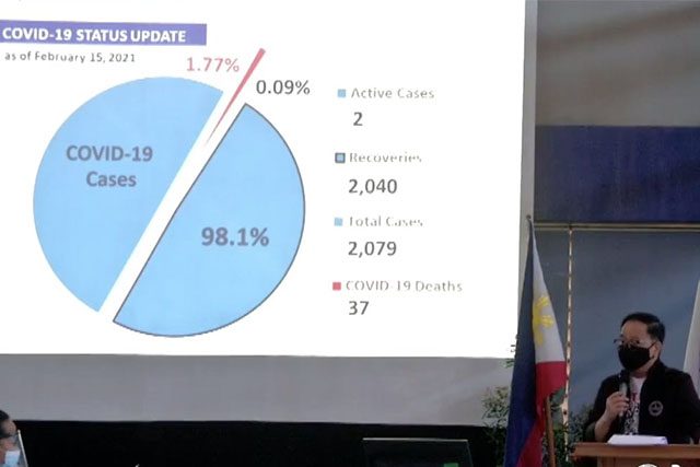
A presentation of Pateros Mayor Miguel Ponce III‘s status update on his municipality’s coronavirus disease cases through data visualization baffled some Filipinos for how the pie chart was presented.
The mayor on Friday met with officials of the Coordinated Operations to Defeat Pandemic (CODE) Team, headed by the National Task Force (NTF) Against COVID-19 and the Inter-Agency Task Force for the Management of Emerging Infectious Diseases (IATF-EID).
The CODE Team is tasked to provide technical guidance to different local government units, specifically by helping them develop action plans outlining strategies and measures that they intend to carry out to address the pandemic in their localities.
During their visit to Pateros, Ponce briefed them about his municipality’s latest COVID-19 numbers with the help of charts and graphs.
The NTF Against COVID-19 shared some pictures of the presentation on its Twitter account where it earned some comments from Filipinos who questioned how the data were arranged and presented.
“Pateros Mayor Miguel Ponce III presents their COVID-19 status update, there are only 2 cases as of 15 Feb 2021,” the task force tweeted.
Pateros Mayor Miguel Ponce III presents their COVID-19 status update, there are only 2 cases as of 15 Feb 2021. pic.twitter.com/GHZDZKkSgH
— National Task Force Against COVID19 (@ntfcovid19ph) February 19, 2021
Ponce presented a pie chart that was divided in half. But a small portion in red color was inserted in the middle.
He said the town has a total COVID-19 case of 2,079.
Of which, the municipality recorded a “total recovery of 2,040” which is “equivalent to 98.1%”
“37 deaths equivalent to 1.77% of the total positive cases. We will be very proud to tell you that the active cases as of February 15, 2021 are only two,” Ponce continued.
Some Filipinos who saw the NTF’s tweet that showed the municipality’s cases claimed they were confused by the data chart.
“98.1% pero kalahati. Hala ‘di ata marunong maghiwa ng pizza,” a Filipino who attempted to understand wrote in response to the chart.
“Ha, pie chart divided into two 98%????” another Twitter user exclaimed.
“Kaloka ang pie chart. Mas matino pa gawa ng Grade 1 tutee ko,” a different Filipino claimed.
Peter Cayton, a statistics professor from the University of the Philippines-Diliman and a Pateros resident, likewise expressed his reaction to the questionable presentation.
“Mayor, huhuhuhu ayusin natin ang presentation… Walang sense ‘yung pie chart,” he tweeted.
A pie chart is a type of graphic that displays data on circular graph. It is a special chart that uses “pie slices” to show the relative sizes of data.
The “pie slices” of the graph are proportional to the fraction of the whole in each category.
For example, one-half would show a pie chart equally divided into two.
Charts are part of a strategy in data visualization that aims to offer a more comprehensible and accessible way to see and understand trends and figures.


