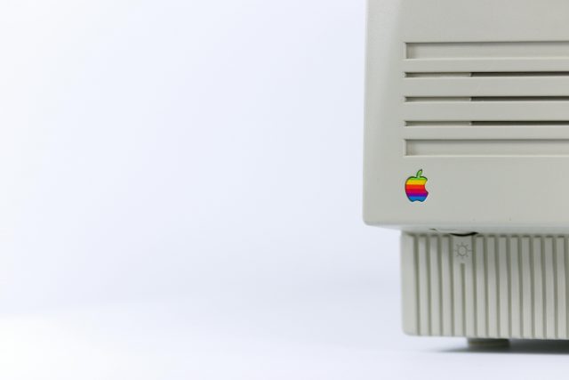
Technology innovation requires solving hard technical problems, right? Well, yes. And no. As the Apple Macintosh turns 40, what began as Apple prioritizing the squishy concept of “user experience” in its 1984 flagship product is, today, clearly vindicated by its blockbuster products since.
It turns out that designing for usability, efficiency, accessibility, elegance and delight pays off. Apple’s market capitalization is now over US$2.8 trillion, and its brand is every bit associated with the term “design” as the best New York or Milan fashion houses are. Apple turned technology into fashion, and it did it through user experience.
It began with the Macintosh.
When Apple announced the Macintosh personal computer with a Super Bowl XVIII television ad on Jan. 22, 1984, it more resembled a movie premiere than a technology release. The commercial was, in fact, directed by filmmaker Ridley Scott. That’s because founder Steve Jobs knew he was not selling just computing power, storage or a desktop publishing solution. Rather, Jobs was selling a product for human beings to use, one to be taken into their homes and integrated into their lives.
This was not about computing anymore. IBM, Commodore and Tandy did computers. As a human-computer interaction scholar, I believe that the first Macintosh was about humans feeling comfortable with a new extension of themselves, not as computer hobbyists but as everyday people. All that “computer stuff” – circuits and wires and separate motherboards and monitors – were neatly packaged and hidden away within one sleek integrated box.
You weren’t supposed to dig into that box, and you didn’t need to dig into that box – not with the Macintosh. The everyday user wouldn’t think about the contents of that box any more than they thought about the stitching in their clothes. Instead, they would focus on how that box made them feel.
Beyond the mouse and desktop metaphor
As computers go, was the Macintosh innovative? Sure. But not for any particular computing breakthrough. The Macintosh was not the first computer to have a graphical user interface or employ the desktop metaphor: icons, files, folders, windows and so on. The Macintosh was not the first personal computer meant for home, office or educational use. It was not the first computer to use a mouse. It was not even the first computer from Apple to be or have any of these things. The Apple Lisa, released a year before, had them all.
It was not any one technical thing that the Macintosh did first. But the Macintosh brought together numerous advances that were about giving people an accessory – not for geeks or techno-hobbyists, but for home office moms and soccer dads and eighth grade students who used it to write documents, edit spreadsheets, make drawings and play games. The Macintosh revolutionized the personal computing industry and everything that was to follow because of its emphasis on providing a satisfying, simplified user experience.
Where computers typically had complex input sequences in the form of typed commands (Unix, MS-DOS) or multibutton mice (Xerox STAR, Commodore 64), the Macintosh used a desktop metaphor in which the computer screen presented a representation of a physical desk surface. Users could click directly on files and folders on the desktop to open them. It also had a one-button mouse that allowed users to click, double-click and drag-and-drop icons without typing commands.
The Xerox Alto had first exhibited the concept of icons, invented in David Canfield Smith’s 1975 Ph.D. dissertation. The 1981 Xerox Star and 1983 Apple Lisa had used desktop metaphors. But these systems had been slow to operate and still cumbersome in many aspects of their interaction design.
The Macintosh simplified the interaction techniques required to operate a computer and improved functioning to reasonable speeds. Complex keyboard commands and dedicated keys were replaced with point-and-click operations, pull-down menus, draggable windows and icons, and systemwide undo, cut, copy and paste. Unlike with the Lisa, the Macintosh could run only one program at a time, but this simplified the user experience.
The Macintosh also provided a user interface toolbox for application developers, enabling applications to have a standard look and feel by using common interface widgets such as buttons, menus, fonts, dialog boxes and windows. With the Macintosh, the learning curve for users was flattened, allowing people to feel proficient in short order. Computing, like clothing, was now for everyone.
A good experience
Although I hesitate to use the cliches “natural” or “intuitive” when it comes to fabricated worlds on a screen – nobody is born knowing what a desktop window, pull-down menu or double-click is – the Macintosh was the first personal computer to make user experience the driver of technical achievement. It indeed was simple to operate, especially compared with command-line computers at the time.
Whereas prior systems prioritized technical capability, the Macintosh was intended for nonspecialist users – at work, school or in the home – to experience a kind of out-of-the-box usability that today is the hallmark of not only most Apple products but an entire industry’s worth of consumer electronics, smart devices and computers of every kind.
According to Market Growth Reports, companies devoted to providing user experience tools and services were worth $548.91 million in 2023 and are expected to reach $1.36 billion by 2029. User experience companies provide software and services to support usability testing, user research, voice-of-the-customer initiatives and user interface design, among many other user experience activities.
Rarely today do consumer products succeed in the market based on functionality alone. Consumers expect a good user experience and will pay a premium for it. The Macintosh started that obsession and demonstrated its centrality.
It is ironic that the Macintosh technology being commemorated in January 2024 was never really about technology at all. It was always about people. This is inspiration for those looking to make the next technology breakthrough, and a warning to those who would dismiss the user experience as only of secondary concern in technological innovation.![]()
Jacob O. Wobbrock, Professor of Information, University of Washington. This article is republished from The Conversation under a Creative Commons license. Read the original article.


