It’s not just you.
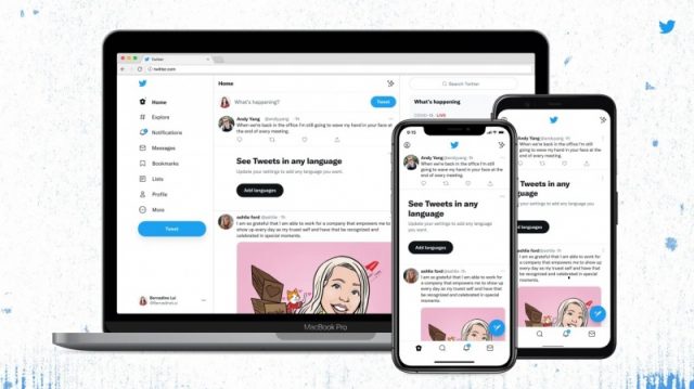
Twitter users were greeted with “black” follow buttons and a different font on Thursday when they logged in to the microblogging platform through the app and the website.
I really need to ask. Did twitter change its font? Nag-iba bigla e???
— Hanash Daily (@infantcee) August 12, 2021
owwww just noticed that twitter bg is black not the usual dark blue 😂 and the font ? hahaha what's up twitter ?
— 💜♥️ ⟭⟬ ᴮᴱ Ayiesha ⁷ ⟬⟭ 🍑 (@khimmyCo) August 12, 2021
Nagiba ba yung font ng twitter? then kulay black na yung 'follow' button. Hmmm.
— Mackoy (@itsmackoy) August 12, 2021
Among those who noticed the font change were voice talent Inka Magnaye, who commented on liking the new font.
I like it ✨
— Inka Magnaye (@inkamagnaye) August 12, 2021
Twitter also confirmed the font change on its own account.
okay confirmed it did
— Twitter (@Twitter) August 11, 2021
The platform offered a more detailed explanation on its Twitter Design account.
According to them, the updates are meant to make the platform “more accessible, unique, and focused” on the users and what they’re talking about.
The new font is called “Chirp,” which makes Western-language texts align left and “easier to read” as users scroll, Twitter said.
Non-Western languages, however, remain unchanged.
Derrit DeRouen, creative director for the company’s global brand, explained that the change is to primarily improve how they “convey emotion and imperfection.”
“In the history of the company we’ve either relied on someone else’s typeface, from SF Pro and Roboto, to Helvetica Neue in our brand,” he tweeted.
“Regardless of whether you’re pro or anti-Helvetica, I think we can all agree that it’s not up for the job. So, that brings us to ‘Chirp’, our first-ever proprietary typeface,” DeRouen added.
Apart from giving the platform its own form of visual expression, “Chirp” is also meant to allow for more personality.
“For everyday use, it must be sharp and legible (with good density), but with personality and distinctiveness,” DeRouen said.
“We also use it at scale for motion and OOH. Here it’s got to be the life of the party… fun and irreverent… but able to carry a serious tone when the subject calls,” he added.
Rounded tittles and punctuation introduce a humanist character. The result is a versatile, contemporary family (82 styles across Standard and Display!) with international sensibilities. It accomplishes exactly what we need and it has made itself the hero of our refresh. pic.twitter.com/3pvcdmKmrI
— Derrit DeRouen (@DerritDeRouen) January 27, 2021
Twitter also updated its colors “to be high contrast and a lot less blue” so that attention will be given to the photos and videos that users create and share on the platform.
“We’re also rolling out new colors soon, giving you a fresh palette,” it said.
“Our new buttons are high contrast too. Now the most important actions you can take stand out. Yes, the follow buttons look different, but they’ll help you see what actions you’ve taken at a glance,” the platform added.
“Finally, we cleaned up a lot of visual clutter. There are fewer gray backgrounds and unnecessary divider lines. We also increased space to make text easier to read,” it further said.


