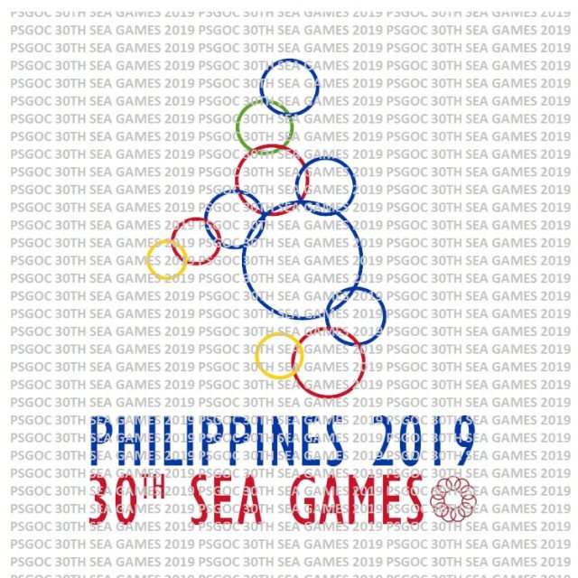
Filipinos poked fun at the recently unveiled 2019 Southeast Asian Games logo for looking like rubber bands, aquatic rings and a famous Disney character among other things.
Not too warm reception
Foreign Affairs Secretary Alan Peter Cayetano presented the Philippines’ chosen logo for the coming sports meet, which will be hosted in Clark, Pampanga.
The logo shows eleven conjoined circles laid out roughly like the Philippine archipelago.
Cayetano explained that the eleven circles represented the eleven Southeast Asian nations and their bond.
But not all Filipinos are impressed with the logo. For some, the logo’s motif has an uncanny resemblance with common objects.
The reportedly 2019 SEA Games logo looks familiar. pic.twitter.com/45OnlwzTI6
— Lee Seng Foo? (@sengfoo88) August 19, 2018
The logo has also been compared to the character Baymax from Disney superhero movie “Big Hero 6.”
So Team Philippines has designed this logo for the SEA Games 2019…
And Baymax says hello!!! pic.twitter.com/MiHANRn3Fw
— Mala-Caña Ang Palace (@Simply_Clinton) August 20, 2018
The official mascots have also come within the radar of critics who pointed out their baffling resemblance to molecules.
If you think our SEA Games logo is bad check out our mascots
Molecules at Work pic.twitter.com/0sLAgiR5eG
— Google Chrom (@SpongyMica) August 20, 2018
Some art critics have explained why the logo did not draw much applause from citizens. Writer Miyako Izabel in a series of tweets explained how familiar and traditional imagery rather than minimalism was more effective when it came to national logos.
She cited Japan’s logo for the 2020 Olympics as an example of the effective use of traditional imagery in crafting a logo.
A national event logo should not only represent an event but also promote the culture, image, values, industries of the event sponsor. In the case of the SEA Games, the Philippines should be creatively promoted. A set of circles forming a strange-looking Phillippine map is lazy.
— Miyako Izabel (@sejoalzir) August 20, 2018
The Japanese logo according to the writer used a textile print and color scheme that was rooted in its traditional art, giving the design a feel that was more in tune with the country’s identity.
She vouched for one of the unused designs, which featured a parol, arguing that it was more in tune with Filipino culture.
@alanpcayetano The logo below, a parol, is better. It's celebratory, Filipino and Southeast Asian–mandala. Find the designer of this logo and ask him to design an original font. The current design is lazy and mindless and will shame our visual culture. Stop wasting public funds. pic.twitter.com/H6eTjfS2c0
— Miyako Izabel (@sejoalzir) August 20, 2018
Some artists have come up with their own takes on the logo, tweaking it to be more representative of the Filipino identity.
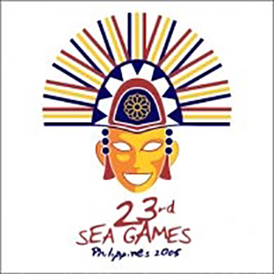
The Philippines used a more traditional logo in 2005 when it last hosted the bi-annual sports meet: a mask based on the ones used during the annual MassKara Festival in Bacolod.


