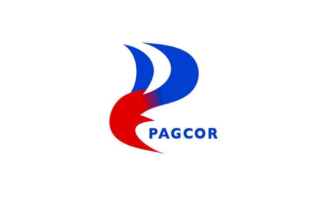
The new logo of the Philippine Amusement and Gaming Corp (PAGCOR) drew flak from some online Filipinos who likened it to a logo of a well-known oil refining firm.
The state-run firm on Tuesday, July 11 launched its new symbol on its 40th anniversary which it said represents its re-energized role as the main gaming regulator in the Philippines.
The new logo features a flame-like design in the combined hues of blue and red.
It replaces the green and yellow symbol of the gaming firm which features a pair of outstretched hands and what appeared to be the sun.
PAGCOR Chairman and CEO Alejandro Tengco said the new logo “incorporates the element of fire associated with energy, inspiration, passion, and transformation.”
“It symbolizes the flame that ignites change and drives progress. The logo likewise reflects a beacon which symbolizes guidance, leadership, and direction. It represents a guiding light that helps people find their way,” he added.
“All these taken together, our new logo reflects PAGCOR’s long-standing commitment of being a guiding force that illuminates the way forward, drives transformation and development, and brings inspiration and motivation to the lives it touches,” the PAGCOR chief said.
The logo quickly earned buzz among the local online community, with some Filipinos saying that it reminded them of Petron Corporation‘s 25-year-old logo featuring two red elements on a dark blue background.
The oil company calls it the “Wave of Change.”
Bakit naman ninakaw yung design sa Petron, PAGCOR? pic.twitter.com/9oZAfqc7zc
— @pauloinmanila and 99 others (@pauloMDtweets) July 11, 2023
Kaganda ganda naman ng bagong logo ni #PAGCOR. Akala yata ng designer PETRON nagpagawa. 😂😂😂 Petron yarn? pic.twitter.com/O3o6WSI7TQ
— Geyzson Kristoffer, CSS 🏆 (@GeyzsoN) July 11, 2023
A Facebook user believed that PAGCOR’s reasoning for its new logo “still aligns with the old one.”
Another Facebook user also offered his two cents about the purpose of logos.
“The purpose of a logo is to represent an organization’s identity and values. It should be visually appealing, meaningful, and memorable,” Greg Sumogat wrote in a post on Wednesday, July 12.
He described PAGCOR’s new logo as a “lackluster design that fails to capture the essence of the organization or evoke any sense of pride or connection.”
“There are talented and skilled designers who would have been more than willing to create a meaningful and appealing logo at a fraction of the cost,” Sumogat added, claiming that the gaming regulator spent P3 million for the design.
Other Facebook users uploaded a scanned copy of a publicly available “Notice of Award” granted by the gaming regulator to Francisco Doplon, proprietor of Printplus Graphic Services. It was dated June 27, 2023.
“Procurement of Requirements for PAGCOR’s 40th Anniversary — procurement of the New Logo Design of PAGCOR under ITB No. SS23-06-035COR,” the subject line of the notice reads.
The notice was signed by Victor Mallillin, special assistant to PAGCOR President, COO Juanito Sanosa Jr.
“We are pleased to inform you that the Philippine Amusement and Gaming Corporation (PAGCOR) accepted your quotation for the above-mentioned project in the total contract price of Three Million Thirty-Five Thousand Seven Hundred Fourteen Pesos and 28/100 (PhP3,035,714.281), VAT Exclusive, Zero-Rated Transaction,” it said.
Lawyer Gideon Peña said that the gaming regulator “could have opted to conduct a logo-making contest.”
“With the creativity of Filipinos, a much better logo could have surfaced, especially if the winning design would be awarded millions of pesos,” he tweeted.
Logos are primarily used for identification, but they can also serve to communicate significant brand messages and values.
For a global creative platform, a “good logo” is able to show “what a company does and what the brand values.”


