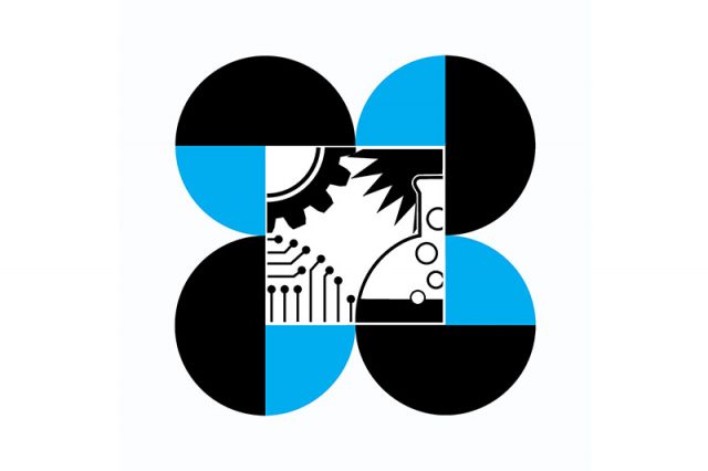
A council under the Department of Science and Technology took the chance to explain the meaning of its logo and its elements as talks of symbols emerged following the buzz on a gaming regulator’s logo change.
DOST’s Philippine Council for Industry, Energy and Emerging Technology Research and Development (PCIEERD) on July 13 reshared a Facebook post about its profile picture change last June.
The profile picture featured its logo while its accompanying caption featured the explanation behind each of the logo’s elements.
“Alam mo ba ang storya sa likod ng DOST PCIEERD logo?” the council said on its July reshare.
It added that its logo was designed with the key elements of the logo of DOST — its parent agency — as the basic pattern.
PCIEERD said that the DOST’s logo consists of four joined circles, which it said represents the “four guiding principles” in their science and technology development — excellence, relevance, cooperation, and cost-effectiveness.
Meanwhile, the colors used in the DOST’s logo represent the following:
- Black: The unknown
- Blue: Progress
- White: Truth and enlightenment
For PCIEERD, however, its center features designs instead of a black diamond.
The council said that its designs symbolize the icons for each of its namesake — industry, energy, emerging technology, and science.
In the logo, industry is represented as mechanical gear, while energy is represented by a flame.
Emerging technology, meanwhile, is represented by a circuit board, while science is represented by a flask.
“The design depicts PCIEERD’s mandate on strengthening and utilizing research and development in industry, energy and emerging technology for the country’s sustainable socio-economic development,” the council said in its caption.
An explanation of the PCIEERD’s logo can also be seen on its website, with the text posted in 2013.
The council’s intention to share the story behind its logo came amid the buzz on the new symbol of the Philippine Amusement and Gaming Corporation (PAGCOR).
PAGCOR on July 11 launched its new logo on its 40th anniversary, replacing the green-and-yellow symbol that Filipinos have known for several years.
The logo change failed to amuse some Pinoys, with some offering other alternatives for the simpler symbol.
Others admitted that gaming regular’s new logo reminded them of a well-known oil refining firm.
READ: Division over PAGCOR logo inspires creative redesigns | Petron copycat? Here’s what people say about PAGCOR’s new logo
Some thought that the reasoning behind PAGCOR’s new logo “still aligns with the old one.”
PAGCOR Chairman and CEO Alejandro Tengco previously said the new symbol “incorporates the element of fire associated with energy, inspiration, passion, and transformation.”
“It symbolizes the flame that ignites change and drives progress. The logo likewise reflects a beacon which symbolizes guidance, leadership, and direction. It represents a guiding light that helps people find their way,” he added before.
“All these taken together, our new logo reflects PAGCOR’s long-standing commitment of being a guiding force that illuminates the way forward, drives transformation and development, and brings inspiration and motivation to the lives it touches,” the PAGCOR chief said.
Last week, a House resolution was filed by the Makabayan bloc which is seeking a probe about the gaming regulator’s new logo.
The minority lawmakers wanted to determine whether the procurement process was above board.
RELATED: No ‘P3M’ here: School’s logo contest references PAGCOR logo project


