


Cinemalaya’s latest poster is getting flak for its design that looks like “magazine cut outs” of cameras with insect wings and various flowers pasted on a blue sky background.
LOOK: The official poster of #Cinemalaya2018! See you all on August 3 to 12!!! pic.twitter.com/gLAXYRW6bK
— Cinemalaya (@cinemalayaoffcl) July 4, 2018
User @JoannaDerpina likened it to that of “magazine cut outs” pasted together to form the artwork.
Another user, @munkeedeeluffee said that it appeared as if the poster was something one might encounter on a single “terror professor’s” desk.
User @spdrmntomstan shared a meme and edited it in a way to hypothesize what possibly happened during the poster making process.
— ?️?joyce (@spdrmntomstan) July 5, 2018
The polygonal lasso tool is an option in Adobe Photoshop that allows anyone to select objects or elements in the frame with an irregular or an angled shape.
The pen tool, meanwhile, is used when an individual wants to draw all types of curves within the frame.
User @beans_solomon added that the graphic designer might have been paid meagerly.
C: Pagawa po poster
GA: magkano po budger niyo?
C: Free po sana hehe
Say no more
— sgesge (@beans_solomon) July 5, 2018
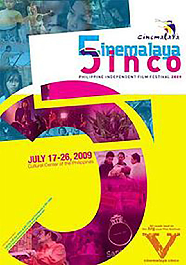
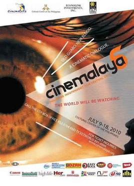
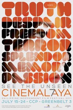
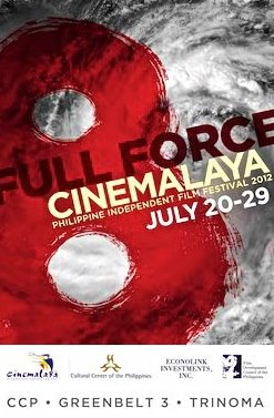
Past posters of Cinemalaya
Cinemalaya is the prestigious independent film festival that is annually held by Cinemalaya Foundation, Inc. in the Cultural Center of the Philippines.
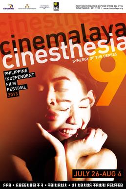
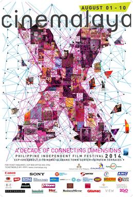
For the past 13 years, Cinemalaya has been releasing provocative and striking posters to promote their event. Here are some gathered:
For 2016, this was the poster design:
#TGIF indeed! #Cinemalaya2016 pic.twitter.com/29EIc1aoTv
— Cinemalaya (@cinemalayaoffcl) August 19, 2016
While this was the one for 2017:
See the big picture! Catch the 13th @Cinemalaya Philippine Independent Film Festival this August 5-13 at Ayala Malls Cinemas. pic.twitter.com/mvSkOeQHcC
— Ayala Malls Cinemas (@ilovesureseats) July 28, 2017
The importance of poster designs
Posters were originally text-filled — solely meant to deliver news, upcoming events, elections and announcements before newspapers gained prominence.
Eventually, they became an advertiser’s means to promote their brand and entice people.
While its initial purpose is to promote, The Guardian notes that a good poster “should be more than advert” and “more than just a hand-waving plea of ‘Come and see me!'”
Its design should not just portray the event itself but “offer broader connotations” about the nature of the event and the organization handling it, it said.
Occhi Magazine additionally notes that the poster is the most important feature of an event, particularly movies. It is the “main design element that captures a person’s interest.”
A good poster should have a “right balance” that properly conveys the event’s theme, it said.
“Too many elements in the design will force a viewer to overthink. People will find it difficult to interpret and gloss over it. A lack of key elements in the poster, and you risk a loss of interest because it didn’t convey the message,” it said. — Photos from Wikimedia Commons


